Morgan Stanley, Marketing and Brand, Revision 4
TLDR:
I led the global UX/UI redesign and rebranding of Morgan Stanley’s digital brand, working with the Digital Strategy team and collaborating with partners across the firm, building a new team as I progressed.
I also took the lead on web accessibility compliance (ADA, WCAG compliance), working closely across design, product, and engineering to remediate existing digital properties and make sure that new work within my purview had ADA-compliance baked in.
The “how”: Starting with a small team and being one of the first hires in the new larger group, I practiced hands-on desiogn leadership, at one point even switching tools (Sketch to Figma) and the resulting standards and guidelines created, including the R4 Design System, are still in use today—setting a bar for the future reimagining of the Morgan Stanley digital brand.
My Achievements
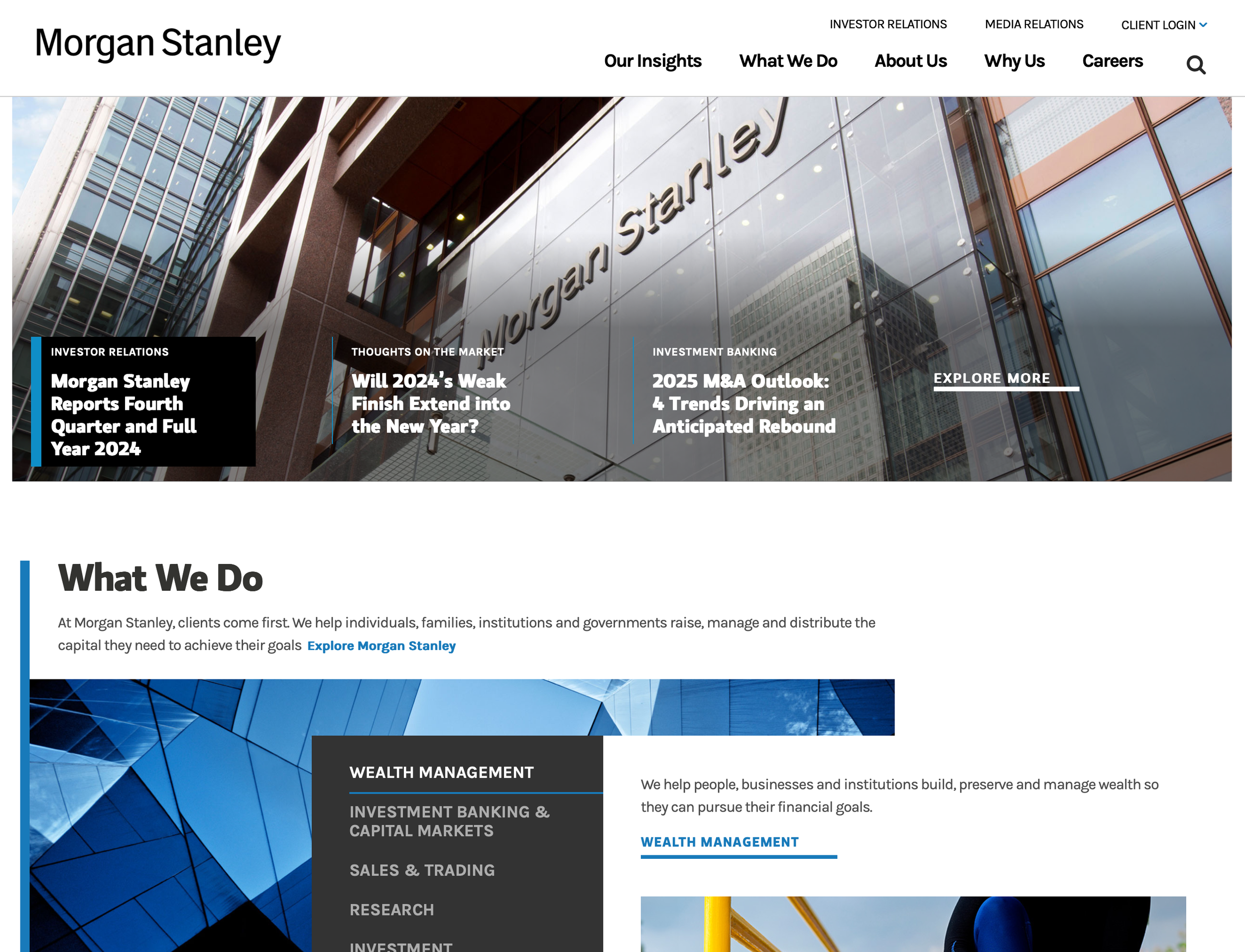
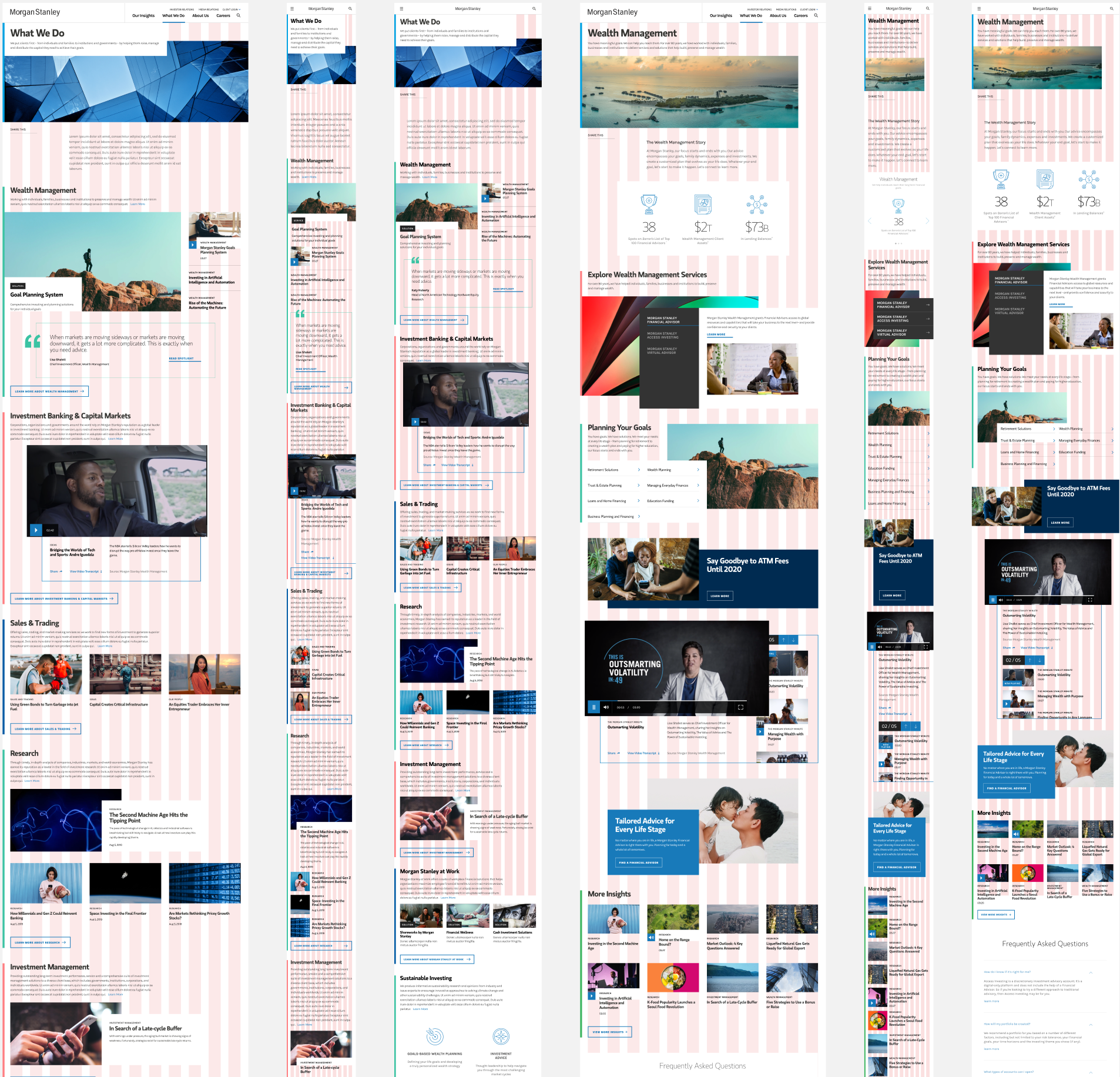
A MarCom Award-winning global website: Modern, vibrant, and accessible, morganstanley.com defines the digital brand and identity of Morgan Stanley.
A new design system—first in Sketch and then later migrated to Figma—with a distinctive, almost organic, and flexible array of options for different Morgan Stanley internal clients to use.
The foundation for succeeding rebrands across Morgan Stanley’s two major divisions—Institutional Investing and Wealth Management—along with its sub-brands (for example, I was later in a consulting position for Morgan Stanley @ Work’s redesign and further extension of the “R4” system.
Web accessibility has been brought to a higher maturity level, not just within the Marketing and Brand Teams, but across the firm in general.
My Role
UX Lead and Accessibility Lead
The Initial Problem
There were initially two main motivating factors: the need for stronger accessibility compliance and the desire for modernization of the digital brand.
The Team
UX and UI team
Dev lead and team
Product manager
Senior stakeholders
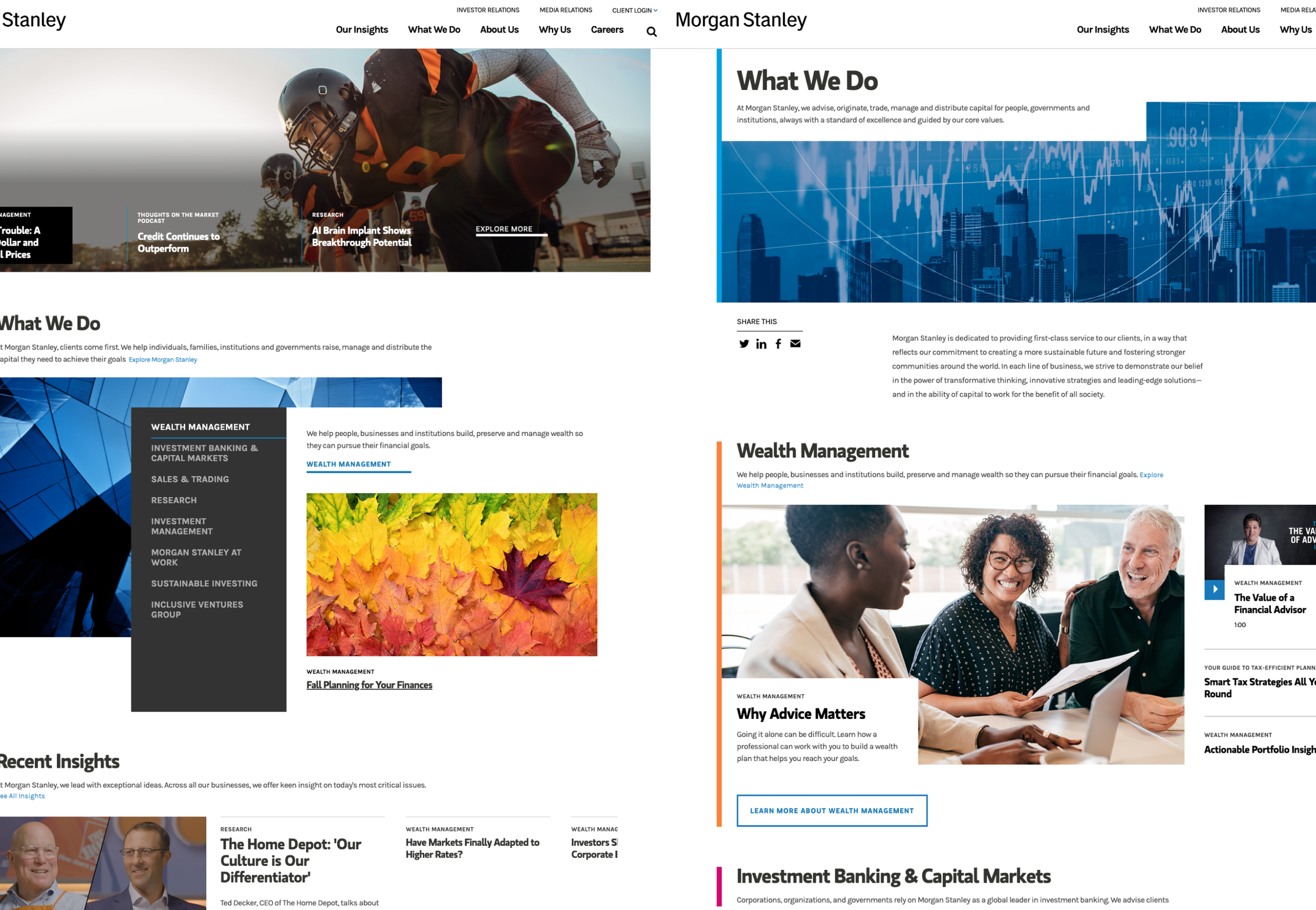
1. The Digital Brand Revisited
Along with a comprehensive rebrand, the current palette for morganstanley.com—and Morgan Stanley’s digital brand in general—diverged into two paths: One path was remediating the legacy site—a separate project by itself that I led as the Accessibility SME. The second path involved the R4 Redesign where I also led UX and accessibility.
Leading UX in the case of Project R4 entailed research, revisiting existing data and research, facilitating conversations with senior stakeholders, and partnering with agency leads. On the more hands-on level, I had a lot of face-to-face collaboration and iterative work with various partners to home in on specific phases through a nearly 2-year period of work (the processes also changed through the COVID era, as collaboration through Zoom became the norm).
But beyond accessibility, the driving philosophy for the final design was the modern feel along with more distinctive and flexible components—which was a significant improvement from the previous (i.e. “R3” design).
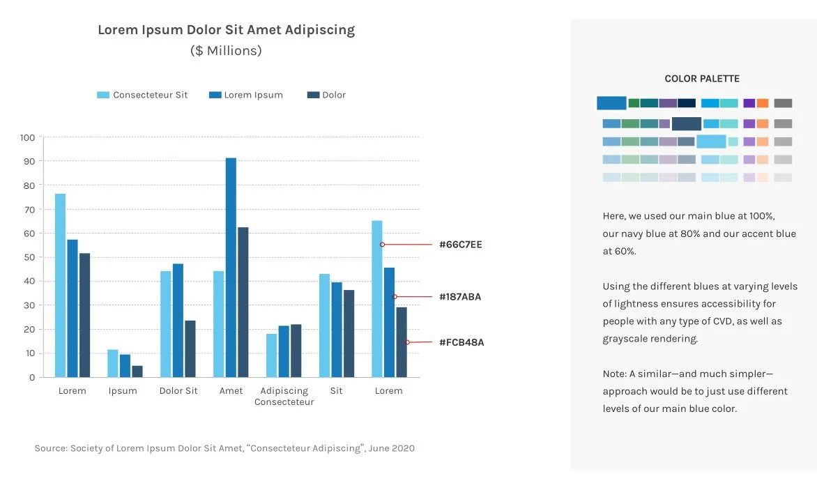
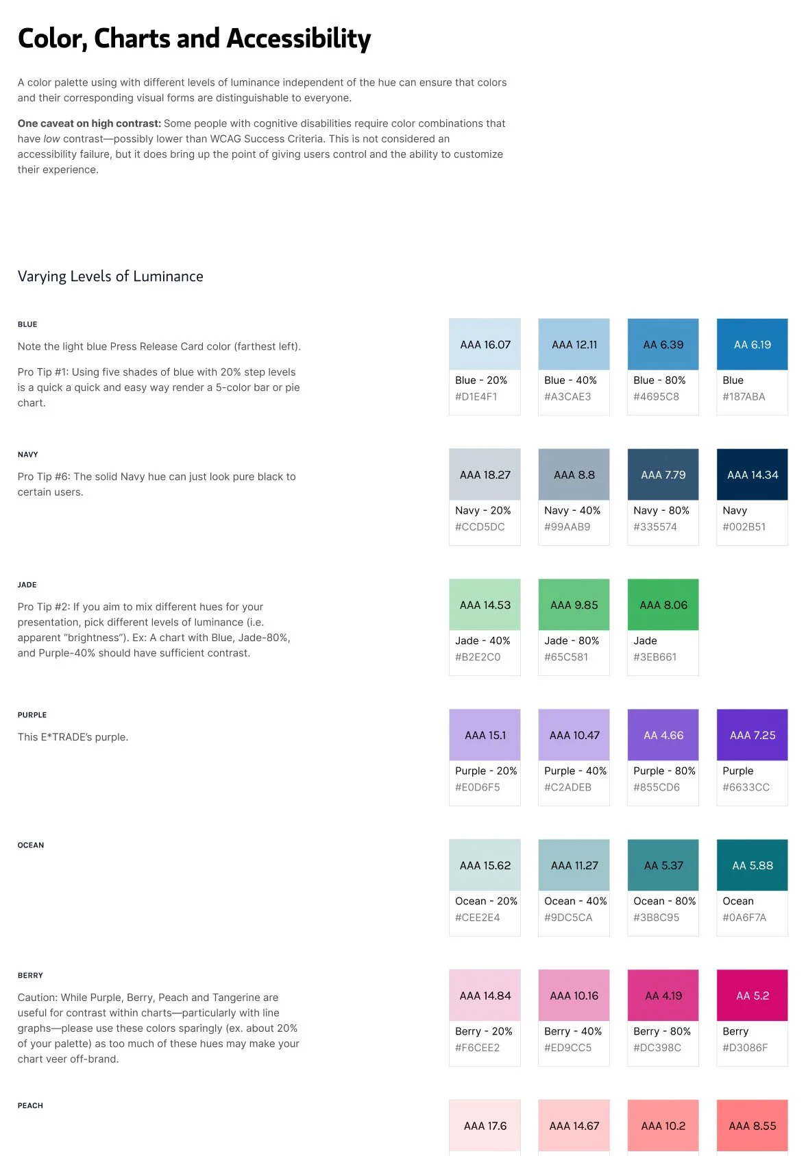
2. Data Visualization and Charting Accessibility
I extracted a new accessible charting palette. This palette is reflective of R4’s more vibrant and modern colors, while also providing a simpler set of colors and specific rules on how to stay on-brand.
I also created guides for Content, Design, and Development as to how to make sure new designs, content, and code need to be done from the get-go with accessibility in mind. Aside from accommodating different Color Vision Deficiency (i.e. “color blindness”), for example, majority of accessibility problems come from the code itself (keyboard issues, focus issues, AJAX-handling, etc.) and the content side (missing alt text, text-on-images, etc.). I was as much Accessibility Engineer as UX Lead for the different stretches of the R4 project.
3. Modern, Vibrant, and Flexible
Part of the vision for the project was to produce a more modern, vibrant, and flexible set of patterns that would be a departure from the older and more homogenous-looking set of patterns of “bento boxes”.
The result is something that feels more organic and yet still has a distinct logic around hierarchy and organization—while at the same time taking into consideration scaling to accommodate our partners and sub-brands.
As UX Lead, I helped create the set of rules on how patterns and components were used and mixed together. I later spearheaded the migration of the system and styles into Figma, wherein I further clarified the same rules and made a templating system available that would make low-to-hi-fidelity mocks faster and much more consistent.
I
4. Sketch to Figma: The Firm-wide Pattern Library
As the point person for Figma in my team, I took the task of consolidating and rebuilding 2 years worth of Sketch files produced between my team and the agency, resulting in a Figma library that can be scaled and grown by my team and our partners.
My goal was for greater efficiency for future design work, while also having a “single source of truth” reference and usable Figma library that our partners and stakeholders can use—whether or not they rely on my team for UX/UI work. Consistency, efficiency, and decreasing friction were my goals.
5. Governance & Scalability for Partners
Apart from the the R4 project itself, there were initiatives that followed partners and sub-brands wherein I provided UX and branding leadership as well as guidance for UX and ADA/WCAG compliance.
An example here is some work done by the same agency we partnered with Wealth Management’s Morgan Stanley AtWork Team. These patterns build upon core R4 in terms of patterns and branding.